New Year, New Look!
If you’ve not visited the Peer Productions website recently, you might not have seen our shiny new look!
Welcome! I’m Lauren and I wanted to share a look behind the curtain at the process involved in giving our online home a makeover. This was the first big project I oversaw for Peer Productions in my role as marketing officer, and right from the outset, the goal was to revamp and restructure our website in a visually exciting way that would also help more of our visitors to more easily find their way around our site.
Feel free to use our header menu above to take a look for yourself, or read on to learn about the process I followed, step-by-step.
As with many things in the life of a visual learner, thinking about how to get started with a big project resulted in a somewhat convoluted-looking, slightly scary, colour-coded diagram of my plan. But don't worry, there was a method to this seeming madness!
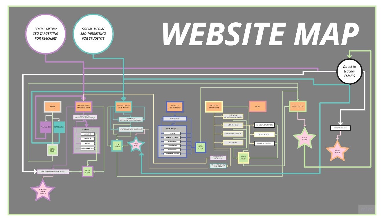
No - that’s not a manic reinterpretation of the London Underground - its a skeleton-style layout for the bones of Peer’s new website. In planning out the restructure, I knew I needed to consider several things.
Who do we want to come to our website?
The first (and most important) thing I realised was that there is more than one neatly categorisable group of people coming to our website, and that each of those different groups of potential visitors has a different goal in mind. One group, teachers and educators, might come to us wanting to find out more about our resources, projects, and upcoming tours. Another group, young actors, might come looking for info about our actor development programme. In restructuring the site, I always tried to keep these key groups in mind, and to think about moving them towards a clear end goal.
In my diagram, teachers' journeys are shown in purple, and potential applicant journeys are shown in turquoise.
Where will people be coming to our site from?
People who come into our site could be coming from our different social media channels, from Google, or - if they're an established contact, they might be coming directly from an email sent by the lovely Alice about our upcoming tours and workshops.
In my diagram, the different possible intakes are represented by the circles at the top.
What will their goals be from visiting our site OR what do we want them to do whilst they're here?
Having figured out who might be coming to our site and where they might be coming from, I also built clear goals into my planned restructure. In the diagram above, these are represented by the four stars.
Book a Tour (Orange Star)
Purchase a package for Digital Hidden (Purple Star)
Apply for our Actor Development Programme (Turquoise Star)
Get in Touch (Green Star)
Whilst some of these goals, like booking a tour or purchasing a digital package were only relevant to teachers, and others like applying for our actor training were only relevant to another group of users, planning out multiple possible user journeys really helped me to think about how to make the site as useful as possible both for visitors and for us - making sure the right people ended up in the right place.
It also became obvious that across all the possible categories of people who might visit our site, encouraging them to “Get in Touch With Us” should be the key goal of the website. To help with this, every page now has a contact form at the bottom where people can tell us about themselves, and find out more about how Peer can help.
As the process of actually carrying out the revamp and restructure went ahead, things got tweaked and changed as they always do with a project on this scale. I learnt a huge amount about Squarespace as a platform, and about how the different tools could plug into my existing ideas to make something even better than what I had originally planned. For me, having a clearly visualised plan was a huge help, and it showed me a new way I could use visual creativity and to share my ideas with others.
I hope you enjoy exploring the new website as much as I enjoyed the process of creating it!
Author’s note - Throughout the revamp process web designer and Squarespace specialist Miko from usingmyhead.com was a huge help. I want to thank her for her brilliant resources and support, and for letting me work collaboratively with her (and her adorable cats!) throughout! Thanks Miko!